7 Brand Identity Mistakes Startups Make (And How to Avoid Them)
After rebranding over 300 companies, these are the most common and costly brand identity mistakes we see — and exactly how to fix them.
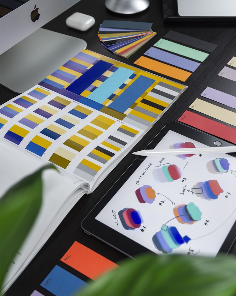
1. Designing a Logo, Not a Brand System
The most common mistake we see startups make is treating brand identity as a logo design exercise. A logo is not a brand. A logo is a single symbol within a much larger visual language.
| Element | Purpose | Typical Deliverables |
|---|---|---|
| Color Palette | Emotion & recognition | 5-8 colors with usage rules |
| Typography | Personality & readability | 3-4 font families |
| Spacing Grid | Consistency | 8pt or 4pt base grid |
| Iconography | Visual shorthand | Custom or curated icon set |
| Photography | Mood & context | Style guide with examples |
| Voice & Tone | Communication | Writing guidelines |
"A professional brand identity is a business asset, not a cost center. Companies with strong, consistent branding command higher prices and retain customers longer."
— Sarah Dupont, Brand Designer at CreativeTag
2. Following Trends Instead of Strategy
Every year brings new design trends: glassmorphism, neumorphism, brutalism, 3D illustrations. These trends are fun to look at. They are terrible foundations for a brand identity. Trends date quickly. A brand built on 2023's hottest aesthetic will look outdated by 2026.
3. Ignoring Scalability and Context
We require every client logo to pass a stress test across multiple sizes and formats:
- 16px favicon
- 32px browser tab
- 64px social avatar
- 128px email signature
- 512px app icon
- Embroidered on merchandise
- Displayed on billboards
4. Designing Without Audience Research
We worked with a fintech startup targeting conservative European investors. Their initial instinct was a bright, playful brand — the opposite of what their audience trusted. After research, we pivoted to deep navy blues and classical serif typography.
5. Inconsistent Application Across Touchpoints
Inconsistency is brand poison. When a user sees different colors, fonts, and tones on your Instagram versus your website versus your email newsletter, they subconsciously question your professionalism.
6. Relying on Cheap Logo Generators
| Approach | Cost | Strategy | Uniqueness | Scalability |
|---|---|---|---|---|
| AI Logo Generator | €0-50 | None | Low | Poor |
| Freelance Marketplace | €200-500 | Minimal | Medium | Fair |
| Brand Agency | €3K-15K | Deep | High | Excellent |
| Premium Agency | €20K+ | Comprehensive | Very High | Excellent |
7. Treating the Brand as Static
Brands are living systems, not museum pieces. We recommend minor brand refreshes every 3-5 years and more significant evolutions every 7-10 years. Apple, Nike, and Google have all evolved their brands dozens of times while remaining instantly recognizable. That is the goal: continuity with progress.
Expert contributor at CreativeTag. Sharing insights and practical guides to help you grow your digital presence.